Click the link
Category Archives: Uncategorized
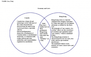
Venn Diagram
My group has demonstrated conversation by running collectively to supply a Venn diagram that correctly depicts the differences and similarities within the colonies of Hong Kong and Canada. We have each communicated our ideas forward to every other and shared our thoughts to merge them into what we have proper now our final product. The Venn diagram turned into the birthchild of both of our wondering, and we couldn’t have done it without every other. We each researched independently and came together ultimately to mix our studies to make the diagram.
We have also demonstrated critical questioning by looking carefully around the web for credible web sites that house relevant and accurate information to apply for our project. We made a listing of websites to apply and cut up the workload to take notes from each site for use, and we also had to effectively take notes from these web sites, as not all of them have been
inside the identical layout or design. Some were blog posts, some had been information articles, and others were lengthy pages of raw data like Wikipedia.
One element we could’ve achieved better was the actual assembly of the diagram itself, we could’ve introduced more flair and contact to the final product to make it look higher, but ultimately, it still conveyed our studies and information flawlessly fine. We could’ve done this via stylizing the circles, adding color, including pictures inside the history or simply adding greater to the cultured in general.
Bring Your Kids To Work Day
digital-footprint by Leo Zhao
https://create.piktochart.com/output/41493728-digital-footprint


